Welcome Guest! To enable all features please Đăng nhập or Đăng ký.
Mình thấy mấy đề có 3 hoặc 4 biểu đồ nữa. Không biết cách cũng như vậy hay có mẹo làm gì khác không?
Các bạn biết share với mình với.
Đa tạ.
Như hình này chắc đúng ý bạn.
Bạn có thể chia thông tin thành 2 nhóm và làm bình thường.
Sample:
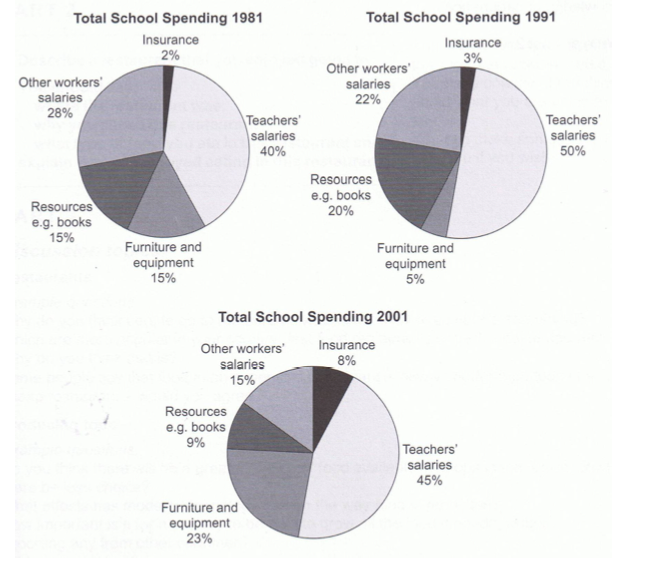
The pie charts compare the expenditure of a school in the UK in three different years over a 20-year period.
It is clear that teachers’ salaries made up the largest proportion of the school’s spending in all three years (1981, 1991 and 2001). By contrast, insurance was the smallest cost in each year.
In 1981, 40% of the school’s budget went on teachers’ salaries. This figure rose to 50% in 1991, but fell again by 5% in 2001. The proportion of spending on other workers’ wages fell steadily over the 20-year period, from 28% of the budget in 1981 to only 15% in 2001.
Expenditure on insurance stood at only 2% of the total in 1981, but reached 8% in 2001. Finally, the percentages for resources and furniture/equipment fluctuated. The figure for resources was highest in 1991, at 20%, and the proportion of spending on furniture and equipment reached its peak in 2001, at 23%.
Bạn có thể thấy trong đoạn 1 viết về 2 loại lương. Còn 3 loại còn lại thì được viết trong đoạn 2.
Có thể bạn chia theo cách khác, vẫn được. Đó là ý kiến riêng của mỗi người.
Thân mến,
Sửa bởi quản trị viên
2013-10-04T08:31:25Z
|
Lý do: Chưa rõ
A wise man will make more opportunities than he finds.
I find this forum very useful. Thank you a lot for your help.
Sửa bởi quản trị viên
2013-10-04T08:24:26Z
|
Lý do: Chưa rõ
Here is my answer:
According to the charts, 50% spending was on teachers’ salaries in 1991 at school. The figures for salaries of teachers in 1981 and 2001 were lower, at only 40% and 45% respectively.
Likewise, the expenditure on insurance fluctuated among three years shown between 2% and 8%. The proportion of furniture and equipment went down by 10% between 1981 and 1991 and then this figure rose significantly to 23% in 2001.
It can also be seen that the figures for resources like books were only 15% in 1981 and 20% in 1991 and 9% in 2001 in that order. Besides, the spending on workers’ salaries was the highest among the three years, at just 28% and the proportion of workers’ salaries was 20% in 1991, compared to only 15% in 2001.
Di chuyển
- Bạn không thể tạo chủ đề mới trong diễn đàn này.
- Bạn không thể trả lời chủ đề trong diễn đàn này.
- Bạn không thể xóa bài của bạn trong diễn đàn này.
- Bạn không thể sửa bài của bạn trong diễn đàn này.
- Bạn không thể tạo bình chọn trong diễn đàn này.
- Bạn không thể bỏ phiếu bình chọn trong diễn đàn này.
Important Information:
The Trang chủ Diễn đàn chuyên IELTS uses cookies. By continuing to browse this site, you are agreeing to our use of cookies.
More Details
Close